Innovative Inspiration and an Invitation
By: Pam Stasney, Kelsie Lally & Sofie Peltier
It’s that time of year again: leaves are falling, fireplaces are crackling, and cozy blankets are calling our name. This month we found our design muses in a glass house, ingenious artisans and an untold story of a remarkable woman. Not to mention, the breathtaking palette painted by Mother Nature.
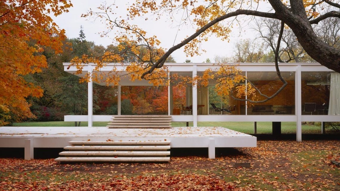
Join us for a virtual tour of The Farsworth House, their latest exhibition “Edith Farnsworth Reconsidered” celebrates the life and times of the home’s namesake. The centerpiece of the exhibit is a temporary refurnishing of the house to reflect its appearance in 1955. Located in Plano, Illinois, The Farnsworth House is a National Historic Landmark in our own backyard. Designed by famed architect, Mies van der Rohe, this glass house has been a pilgrimage destination for generations of architectural enthusiasts.
 Mies Van de Rohe was a German-born architect known for creating open spaces to reveal architectural basics. He started his career in residential design and decided his values of design were too important not to share with others. Mies became the director of the Bauhaus School of Architecture. Upon the closer of the Bauhaus School during World War II, Mies moved to America where he went on to carve the way towards mid-century modern design. The principles of mid-century design worked hand-and-hand with Mies’ own architectural beliefs; it included organic forms inspired by nature, minimal ornamentation, and a mixture of materials to create clean lines.
The Farnsworth house was built in 1951 for Dr. Edith Farnsworth. Needing a place to escape hectic city life, Farnsworth purchased 10 acres of land and tasked Mies Van de Rohe with the job. Mies believed that the role of architecture was to create balance and minimize distractions, exactly what the Farnsworth house does. Consisting of 1,500 square feet of panoramic views, Dr. Farnsworth’s residence is meant to enhance the surrounding natural elements. With no interruption of the surrounding woods, Mies made it feel like the house was meant to be there. A truly innovative way of design thinking.
Speaking of innovation, all of us at Haven are enthralled by artist Lucy Slivinski’s organic and intriguing works, currently on display at Haven’s South 3rd Street location in Geneva, Illinois. We’ve partnered with Cultural Connection to present the exhibit Shine! featuring Slivinski’s creations.
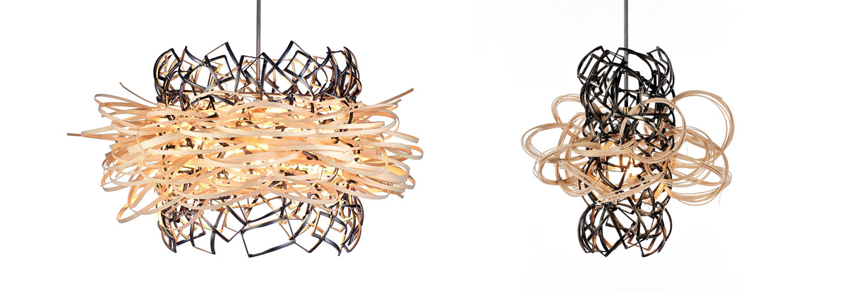
“My work is about revitalization and metaphor… I reshape and reinterpret,” Slivinski says. Her hope is to create art that is “spirit-filled, bold and honest.” Shine! reflects the brilliance and intensity of textural art forms, from materials that are both organic in nature and those that have been repurposed and energized into an emerged, unique art form. As a featured artist at EXPO CHICAGO, Slivinski has many notable awards and exhibits in New York, Chicago, Bordeaux, Havana and has art installations throughout the world. She is both a critically acclaimed sculpture and installation artist.
Lucy Slivinski, like Mies van der Rohe and Edith Farnsworth, inspire and remind us of three simple life lessons:
1. Beauty Is All Around Us
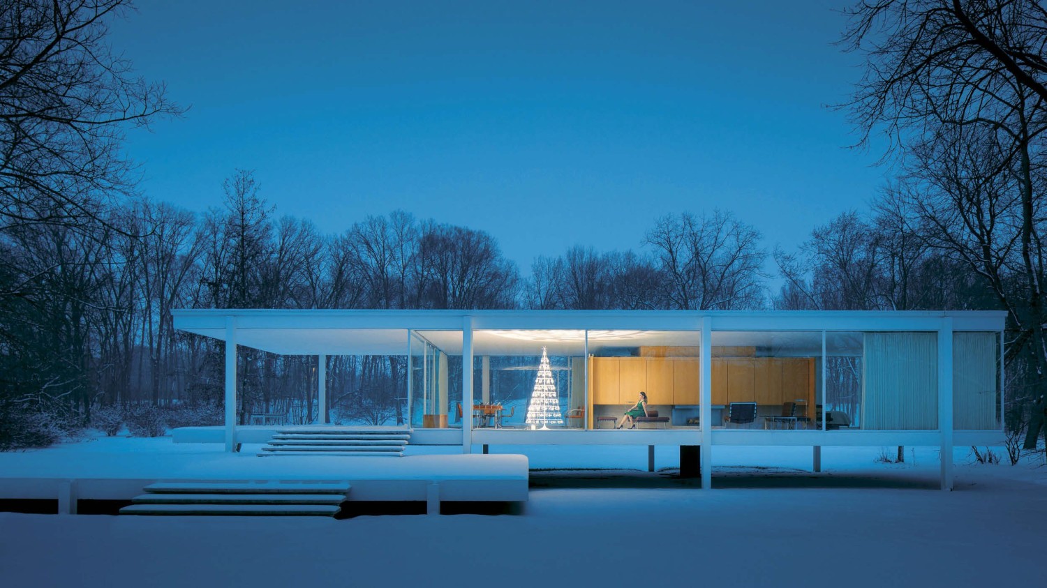 A glass house is built with a front row seat to nature’s lessons. Architect Mies van der Rohe integrated the Farnsworth design harmoniously with surrounding land. No matter the season, beauty is inescapable. In Autumn, the brilliant hues of amber and blazing scarlet ignite a season of change. Winter views bring serenity and a desire for hibernation. Spring beckons rebirth and summer is blanketed in green.
“Nature, too, shall live its own life. We must beware not to disrupt it.” Mies van der Rohe
Take cues from Mies, infuse your interior with windows and a touch of natural beauty. Give yourself a room with a view!
 2. Less Is More
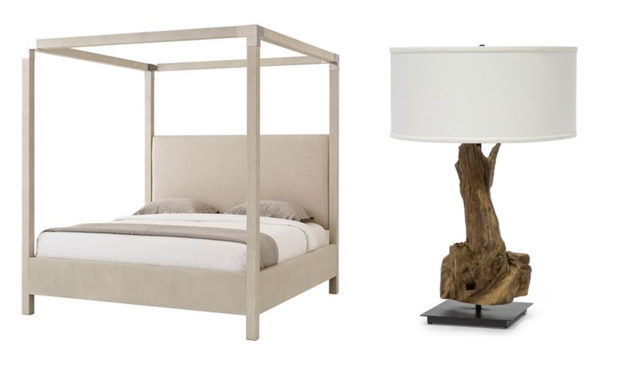
 In line with trending Swedish philosophy Lagom, the Farnsworth house in 1955, echoed the idea of “not too much, not too little.” Minimalism, revered in Mid-century modern design, is timeless. Surrounding self with well-crafted, handmade furnishings is a visual reminder to live a quality life.
Take some time to slow down, look around your home and edit. Eliminate clutter and concentrate on a few, well-made pieces.
 3. Opposites Attract
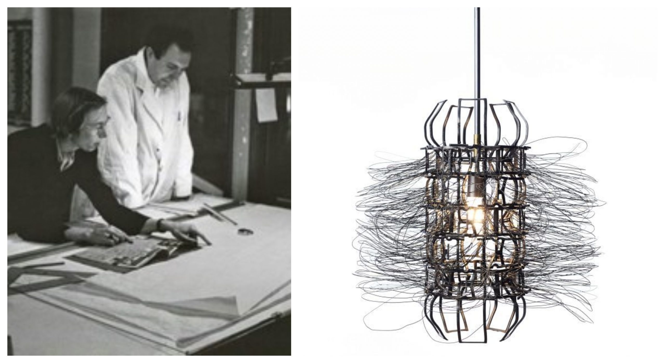 Whether it’s a relationship between an architect and his client, the raw materials used by an artist, or the furnishings we live with, friction brings refinement. A happy home needs harmony: The warmth of wood balances cool metal textures. Luxurious velvets soften rough edges. Contrast enhances a pretty picture.
“We actually understand materials best by contrast. Our senses are wired in such a way that rough feels rougher by contrast with smooth. To get the best out of these materials, we need to find its opposite.” Ilse Crawford, Interior Designer
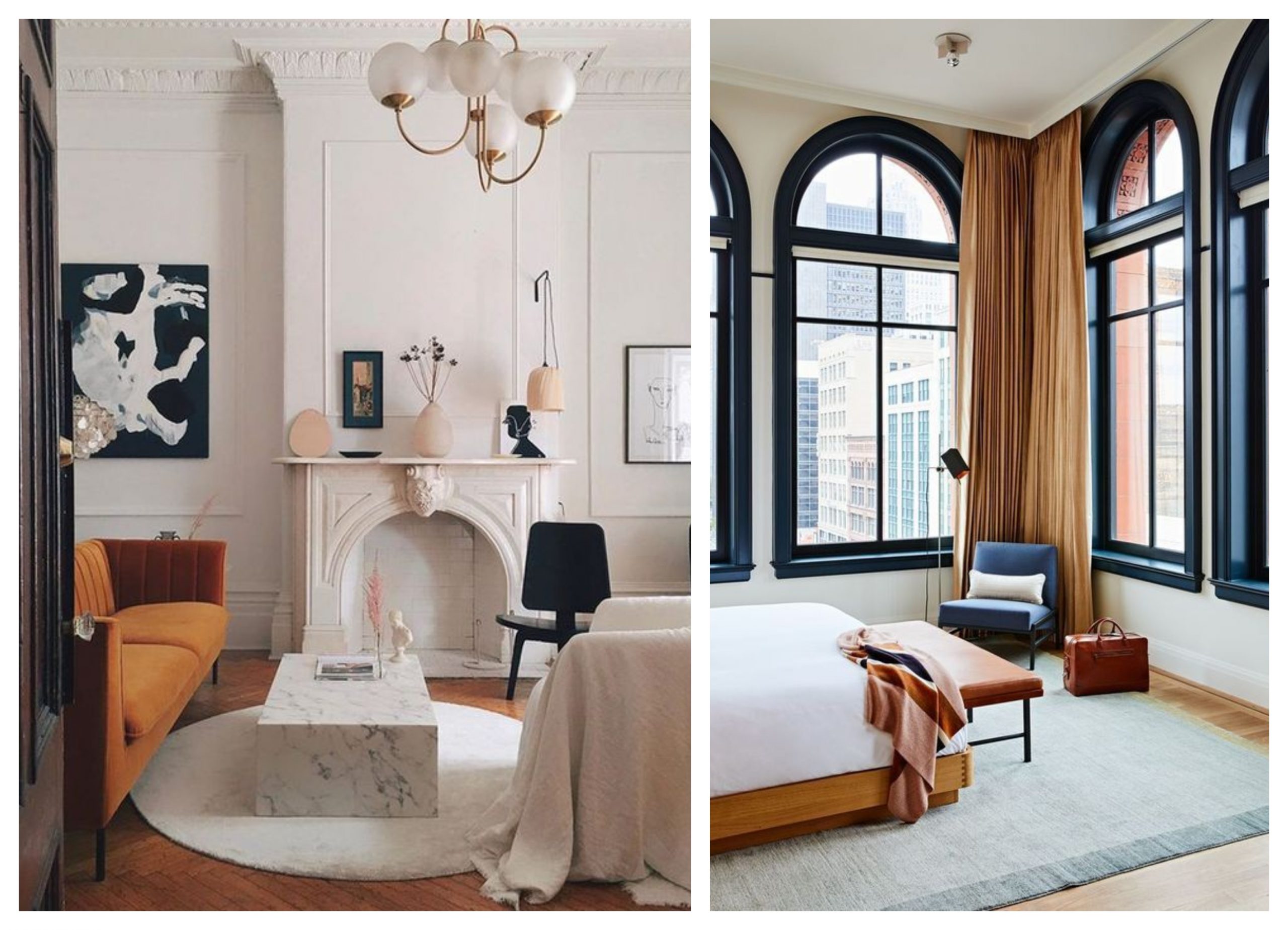
As ruminated in the Sherwin Williams’ 2021 Color Forecast, rhythm is the secret to how the natural world stays in step. How we design a space, brings sactuary or a tapestry of exuberance. Check out their color trends, presented in four palettes, to help you find your own tempo. Find us on Pinterest for more Cozy Harvest Hues and inspiration throughout the season. Happy Fall, y’all!!!
Please visit us at our Geneva location during the exhibit, running now through December 28, 2020.
